Sunday, 31 May 2015

Darkroom vs Digital Techniques - Producing a Digital Negative


Making a digital negative.

Open your image into Photoshop.

Image > Adjustments > Gradient Map.

Image should now be black and white.

Image > Adjustments > Invert (or Command I).

Image will now look like a solarised image.

You will need to adjust the contrast of the image.

You will now need to reverse the image so that when you use it as a negative the image will appear the correct way around.

Image > Image Rotation > Flip Canvas Horizontal.

Final Digital Negative

Darkroom vs Digital Techniques (it's quite a lengthy one!) - Combination/Sandwich Printing, Dodging & Burning, Masking

In January this year we had the opportunity to print some film in which we had to show our use of sandwich/combination, and, dodging and burning.  We also needed to show the use of masks with the dodging and burning technique i.e. we could use a mask to produce a vignette on a photograph.

As with all printing, I made a test strip to decide on the proper exposure time.

I didn’t make a contact sheet of the negatives, as these were old negatives that I had used on previous projects (it might be advantageous to have done this to refer to my images for choice).

I found the sandwich technique really simple, and it produced for me a pleasing effect.

I did use a mask to dodge and make the edge of the photograph lighter, and then I was able to add a second image to the negative carrier in the enlarger.  I had to move the photographic paper so that the negative image would be in the right position.  This wasn’t a simple process; you needed to mark your paper somehow (I put pieces of paper either side to do this, although post-its might be a good option).

I did have to adjust the exposure time when using the two negatives (I had done a test strip on each negative). 

I did think that my paper had possibly been exposed, as it did seem to process very quickly/go dark.  I thought that the possible problem was that I was using an enlarger very close to the darkroom door, and it was constantly being opened and light was coming into the darkroom. I showed the resulting images to Dan, and he said that the paper didn’t seem ‘fogged’ and that it was possibly the aperture on the enlarger needed shutting down to F8, I hadn’t checked this before using the enlarger and this was indeed the problem.  I was pleased that the answer to the problem was so simple.

I did use a mask to make a vignette.  I did a couple of attempts as the resulting images were varying.  I needed to move the oval mask more up and down to get a more faded effect on the vignette.

We were during the following week to take some black and white photographs with a theme.  We were to push our film.  My film was a 400 ISO and to push it I needed change the ISO on my camera to 1600 (2 stops).   (1 stop would be 800, 400 + 400.) (2 stops would be 800 (1 stop) + 800 (1 stop) = 2 stops, 1600.

We had to process our own film during our lesson.  We had to take into account that although our film was ISO 400, we had pushed the ISO to 1600, and therefore we had to process our film as though it were a 1600 film.  The timing for the processing would be 19 minutes.

I had to first loaded my films into the developing tank.  I then processed the film using the ID11 at 300 + 300 and timing for 19 minutes.

The tank lid was not close fitting and some of the liquid did seep out.  To remedy this I did use a towel around the lid when agitating the tank.  After processing the film, I was pleased to find that I did have some negatives that I would be able to use in my combination printing.  I left them to dry for 15 minutes in the drying cabinet.

I did try to do some combination printing, but I wasn’t happy with the result, as I felt a bit rushed.  I then decided that I would return to the darkroom another day to complete my combination printing.

I returned to the darkroom to print my images.  I had purchased some more 8 x 10 paper to develop my negatives onto.  I was quite lucky as the darkroom was empty and I had time to process my photographs.  One of the first things I did was to check the aperture on the enlarger, and make sure that it was at F8.  I took time to do myself another contact sheet for my negatives, and I chose two images that I wanted to use for combination printing.  I did a test strip to decide on the exposure time.  I did a test strip at 2-second intervals.  I decided that 4 seconds seemed to be the correct exposure but when combining the two images I would use 3 seconds, and this seemed to work out fine.  I had to use a mask so as not to expose the paper, and then again mask the other side when using the second negative.  I had marked approximately where I needed the second negative to be on the paper.  I also used the filter to try and see where I was locating the negative. 

I did try a couple attempts at combination printing, and the process got easier as I began to understand about the dodging and burning technique.

As well as combination printing I decided to re-attempt producing a vignette.  As with the combination printing I did get better with each attempt, and realised how I was to use the mask in the process so as not to get a line that was not too harsh.

By the end of my time in the darkroom I was quite pleased with my final images.  They are quite basic but I now know that I can progress to produce other images with this method.


 I will upload some of my images but at the present they are being assessed, so for the time being I will leave you in suspense!!!!

Seeing in Black and White

Today’s assignment was to see in black and white as opposed to colour, which means that we have to think about tone, shade, light and dark.

Colours have 3 main elements: hue, saturation and lightness. Hue is the name of the colour, such as red, yellow, or green. Saturation is the intensity of the colour, while the lightness is the amount of white or black mixed into the colour.

In the most basic terms, hue is what you are taking away from the photograph when you convert to black and white, saturation and lightness, or contrast, are what remain in the grey scale to create tonal contrast. Think of contrast as white vs black and everything in between is shades of grey.

Below is a copy of the zone system used by Ansel Adams


Although there are many things to consider when creating black & white photographs, contrast is at the top. Contrast helps create the mood; a high contrast conveys power and boldness, while a low contrast will evoke a gentler, softer reaction. You need to consider the intention of the shot.  

For this assignment we had to use our DSLR cameras.  The first thing we had to do was to change our camera settings so that our images would be stored as RAW and JPEG, plus we needed to use the monochrome setting on our cameras.

We were to go around the college taking photographs.  We needed to see in black and white, and also to think about a series of images.

I was not sure at first what I wanted to photograph, and just took photographs generally around the college, but after walking around the pond at the back of the college I focused on the branches of the trees, the way they were gnarly, interweaved and tangled.

Once we had enough images we then needed to edit them in Photoshop.  We had been shown how to use the Silver Efex filter. 

We opened our images in Raw first, and we could adjust the clarity and also use the sharpening tool if we needed. 

Emma showed us how to use selective adjustment tool, and to use the control point to adjust a particular spot on our image.  With this you could even produce a vignette.

When it came to editing my images in Photoshop I went to Image > Adjustments > Black and White > Preset > Maximum Black.  I also looked at the levels and histogram and adjusted accordingly.  To get all the images the same it would be worthwhile creating an action, especially when producing a series of images. 

Opening in Camera Raw and converting to Grayscale 

 Opening Nik Collection, Silver Efex Pro 2.


Making an action for seeing in black and white for use in a series.


Workshop - Still Life/Emotion - Fear

For this workshop I was teamed up with Katie.  Our still life shoot had to show the emotion of fear.  When I heard this was what we had to portray my instant reaction was ‘look at my face now’ that’s how you portray fear!

I was in a bit of a quandary and couldn’t really think of how you could emote fear in a still life.  Between Katie and myself we eventually came up with an idea of how things relating to war could bring up the emotion of fear. 

With that in mind and a photograph to hand to give us inspiration we bounced some ideas off each other.  With war in mind I thought that we could use some army related items.  My son used to be a cadet in the army, and I knew that I could use these to add texture to the scene.  I also had some binoculars, and an old camera that could add to the scene.  The problem that we faced though was finding old newspapers showing war scenes, and also trying to get hold of a gun to give the fear element.  I do know someone who works with firearms, and it was really lucky that she was able to lend me an old style gun that we could use in our still life.  As well as these items, I also brought along some different fabrics to add another dimension.  To say the least I was a little bogged down when I came into college.

When talking to Katie we decided that we wanted a low key set up.  Emma helped us to set this up after we had made the mistake of trying to move the large dark backdrop over a trestle table.  This is a mistake that we won’t be doing again.  Emma managed to get us a small backdrop that we draped over the table.  We had decided that we wanted to use a strobe light with a snoot attached. 

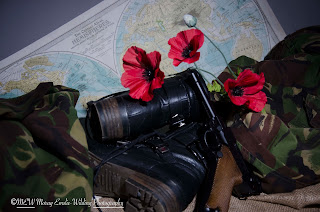
We arranged the various items on the table using the uniform, and some hessian that I had as texture.  I also took my boots off, as they did from the back look a bit ‘army’.  Katie added a world map, and a large poppy flower.

We used a light meter to take a reading, and the reading was between F/5.6 and F/8.0.  As we were working in the studio we used and ISO of 100, with Auto White Balance.  The shutter speed varied between 1/125 and 1/160. 

I used my Nikon D7000 with my kit lens (18-105mm). 

We decided on using a snoot with the strobe light, as we wanted to produce a halo effect.

We also used the radio trigger to control the flash.

We used my tripod to take photographs, but even though it is a good make of tripod, the lens on the camera did tend to droop, so it was necessary to hold the lens in place.  You can buy an attachment to keep your lens stable on a tripod.

After we had used our DSLR cameras we were given the opportunity to use the Mamiya camera, a Medium Format camera.  This was the first time I had used a Medium Format camera.

Emma helped us to load the daylight film into the film holder, and showed us how to operate the Mamiya.  We had to use a step ladder to use the Mamiya because of the angle that we wanted to shoot at.  We also had to use one of the college’s tripod to stabilize the Mamiya.

Before taking our images we took a meter reading which came back at F/5.6.  Where with a DSLR you can vary the reading slightly we had to be more exact with the Mamiya.

We focused the lens and them proceeded to take our photograph of the scene.

'Fear'


Studio Workshops - Still Life/Food Photography

For this workshop we were split into groups of 3-4, and given a food theme to photograph. In my group were Emily and Matt.  We were given the Italian theme.  We had to choose from a range of foods, which included pasta shells and spaghetti, olive oil, tomatoes, and some Italian looking tea towels.  There was also some ciabatta that we could choose to use if we wanted. 

Emma made available to us also a spray containing water and glycerin that could be used to give a shine to food.  This would give the illusion of freshness.

We chose to use the Octobox to light our food.  We were using the Octobox without flash.  We placed the Octobox at an approximate 45 degree angle to the food, and slightly to the back of the food.  The food was placed on a cappuccino coloured background.  For this shoot we needed to use a tripod as we were going to be using longer exposures.  We would also be using the self-timers on our cameras so as to eliminate camera shake.

We didn’t use light meters for this shoot.

I used my Nikon D7000 camera and my kit lens (18-105mm). 

As I was using this lens the F-stop would vary depending on where I focused.

Regarding my White Balance, Emma helped me to adjust the White Balance using kelvin (after a few practice shots Emma adjusted the kelvin to 4170).

We took it in turns to arrange the food and adjust the lighting.  The lighting on this workshop did prove to be quite problematic.  We adjusted the power both up and down.  We also had to contend with reflection from the glass pasta jar.

When arranging the food, we didn’t cut the tomatoes, as we didn’t want to damage the tea towels with tomato juice.  We did use the glycerine spray though to add shine to the tomatoes.

It took quite a bit of patience in order to get what is hoped to be a good food shot.  When taking the shot I decided to shoot straight on, but slightly higher than the food.  This I believed would produce the best composition.

I did find it a quite difficult shoot, but it was also enjoyable.  

I think that we tend to feel that shooting inanimate objects should be quite easy, after all we aren't dealing with a model who has to create poses.  I found the opposite.  You have to position the objects so that the composition is going to give a message, or story.  It's no good just placing objects on a table, they need to be able to interact with each other and give a whole picture.  

The theme we were given was Italian, and the use of tomatoes, pasta, the tricolour tea towels are all used to develop that theme.


The reflection from the October has been removed from the olive oil bottle on the right.  


This image has the olive oil bottle.


In this image I have removed the olive oil bottle using Photoshop.  I much prefer this image to the original.


Friday, 29 May 2015

Studio Workshops - Talia White

In November last year we were lucky enough to have a Workshop led by the talented Talia White.

Talia started at as a student at Solihull College where she studied for 5 years.  She started off in art and design but did want to do fashion and textiles (this wasn’t an option, eventually she went onto went on to study photography).

She has a love of fashion photography.

She has worked in portrait studios, which she has also managed.

She produces work for the likes of TK Maxx.  She also does social media photography for other companies. 

Talia was entered into Young Fashion Photographer of the Year at the Clothes show but she didn’t win.

Talia has contacted different models and celebrities who have consented to model for her.  She photographed one of the stars of Hollyoaks, she did this for free, but the images were finally shown in a magazine, which is good for both the photographer and the model.  Models can be paid for but sometimes they will model for you in return for a selection of images for their portfolio.

Talia has a friend who models for her, and in this case many of the photo shoots are last minute, and under these circumstances Talia will do her own make up and hair.  Talia did use to plan photo shoots quite meticulously, but she found that things didn’t always go to plan, so now she works of the premise of a theme, and generally works around this.

Talia generally works in the studio with one light.  If she wants a white background she will then use more.  Talia doesn’t usually use the white background.  She will use one light, bring the model forward and the background will then become grey.  A white background does use more light.

When working inside and you are using your flash on camera, sometimes it is a good idea to bounce the flash.  When you bounce the flash you can bounce it off the ceiling but it is produces a better effect if you bounce the flash off a wall onto your model.

When doing a photo shoot it is a good idea to have a theme i.e. at Easter – bunny ears, Halloween – spooky costumes, and Christmas – red outfits, Christmassy jumpers, scarves etc.

Preparing for a shoot

Inspiration

  • Mood board
  • Magazine
  • Pinterest
  • Sketch ideas
  • Books – research
  • Colour swatches of tones you want to include

Call Sheet

  • Date
  • Time
  • Shoot/Job
  • Location
  • Creative team details
  • Photographer
  • Make up artist (MUA)
  • Hair stylist
  • Wardrobe stylist

Checklist

  • Charge battery pack
  • Bring extra batteries for flash
  • Format your memory card
  • Prepare your camera bag the night before
  • Provide food and water for the team (check what people eat!)
  • Wear suitable footwear

Creative Team

  • Stylist – Loan clothes, buy them, or they may already have them
  • MUA (Make up artist)
  • Hair stylist
  • Photographer’s assistant (let them take some shots for experience etc. (they carry equipment about, make tea etc.)
  • Digital assistant (if a tethered shoot they sit at a computer and can check if the shot are in focus)

Casting the Right Model

  • Look at the model and see if they fit the style and theme of the shoot
  • Talia does use agencies, but also uses Facebook and Instagram as a way of contacting models for shoot
  • Agencies are generally happy to help if you ask about models doing test shoots, and you say to them that they will receive copies of the images

Lighting Pros and Cons

Natural Light

  • Easily accessible
  • Free to use
  • Harder to control

Studio

  • Need to book in advance
  • Charge for use of the lights
  • Easy to shape and control
  • Talia finds it easier to work in the studio as show knows how it’s going to look, working outside you will have problems with the changing light

Working with Clients

  • Be confident, even if you are terrified (fake it)(don’t show nerves), if you show you are nervous a client will tend to pick at your work
  • Give feedback
  • Be versatile
  • Listen to what the client wants, and as you are being paid for the work you need to do
  • what they want, even if you don’t want to (models probably don’t being dressed up like fairies but as it’s part of the job they will do it)
  • Don’t be too insistent
  • If there’s a problem, then offer an alternative
  • Sometimes you will have to do a re-shoot because the client for instance won’t like the model you have chosen, and you will then have to find a model that the client will like

What’s in My Kit (Talia White)

  • 28-135mm lens (location)
  • 50mm prime lens
  • Lens Baby (creative lens)
  • Reflector
  • Flash gun

Choosing the “right” image

  • Narrow down to 10 images
  • If the client is selecting, send over the contact sheet

Tips for selecting

  • Don’t over shoot, try and limit yourself.  You don’t want too many images, or you could be there all day
  • When shooting for say the millinery website and it a headshot she will take the main shot, side shot, and a shot of the detail
  • Focus (Auto Focus)(Talia uses this because of her bad vision)
  • Exposure
  • Head Shot (Magazine – headshot – front cover.  Leave space above the model’s head for the title of the magazine.)
  • Full length
  • Mid shot
  • Story flows – Editorial (Genre within fashion)(create a story)
  • First submitted work to photography magazines, but you can generally go to magazines gallery pages and upload an image (World of Photography)
  • Talia’s other work has been put on Instagram, and someone has noticed her work from this #editorial (even though the image wasn’t in fact editorial – she blagged it)
  • Landscape (use for a double page spread)
  • Need a variety

After our session in the classroom, we all had a chance to work with both Talia and the lovely model, Hannah Gardner.

Talia demonstrated how she shoots a session, giving us guidance.  Talia generally uses a 28-135mm lens but also uses a 50mm prime lens.  Talia uses a Canon camera.  There is no 28-135mm lens for the Nikon, and a similar lens would be a Tamron 18-200mm lens. 

As with Claire Seville’s workshop we took it in turn to do our photo shoot.

I used my Nikon D7000 camera, with my 40mm lens.  The settings I used on my camera were Manual setting, F8, 1/160 sec., ISO 100, and AWB.  Talia does tend to use ISO 200, but the results using ISO 200 will vary from camera to camera.  Usually when working with flash in the studio I will set the WB to flash, but in this session Talia advised us that she uses AWB, and with this in mind I set my WB to AWB. 

Talia showed us that when using a white backdrop if we brought the model forward, and had the softbox slightly forward of the model, and at approximately a 45 degree angle, that the backdrop would not be white, but a grey.  If you want a white backdrop you then need to light the backdrop so that the backdrop comes out white in your photographs.

I used my 40mm lens so that I would again get in close to the model.  We did two set-ups with Hannah, one with the white backdrop and the square soft box, and one with a fabric backdrop and using the octobox.  We took several images of Hannah in each set up.  I used the steps to try and get different angles of Hannah.  I have a problem, in that in some images I did tend to get the top of the backdrop frame in focus, and this will obviously need editing out in post-production (Photoshop).

Part way through the photo shoot Talia did actually get the light meter out to check the lighting, F-stop etc.  We were using F8, and the light meter was registering F9.  Talia thought that using F8 would still be ok.


I did take 21 images using both the softbox and octobox.

It was a fantastic workshop, and I really felt that I learnt a lot from Talia.